Sunday, March 9, 2008
"No War", Nerd Style
Though designers might get this, I dont think government officials will. Points for creativity though!


Friday, February 22, 2008
Thursday, February 21, 2008
Boredom sparks creativity!
Apparently the Philipino prison system believes in incorporating music in to the rehabilitation of its inmates. Enjoy this rendition of thriller, courtesy of about 1000 Philipino prisoners. Classic.
Tuesday, February 12, 2008
Hotel Chat
I was chatting with a friend of mine who happens to be in hotel development and he was telling me some of his favorite hotels in the world. And...I agree, they are quite amazing.
Villa D'Este, Lake Como, Itlay
Only opened March through September.


Four Seasons Hotel, Gresham Palace, Budapest
The renaissance of an Art Nouveau landmark, exquisitely transformed with ultra-modern comforts, Four Seasons combines luxury and intuitive service with panoramic vistas of the Danube and the hills of Buda.


Villa D'Este, Lake Como, Itlay
Only opened March through September.


Four Seasons Hotel, Gresham Palace, Budapest
The renaissance of an Art Nouveau landmark, exquisitely transformed with ultra-modern comforts, Four Seasons combines luxury and intuitive service with panoramic vistas of the Danube and the hills of Buda.


Monday, February 11, 2008
Art or Walmart?

Do you think you are an art connoisseur? Do you think you can tell the difference between expensive designer furniture and Walmart furnture? Well, take the quiz and find out...
Donald Judd vz. Walmart quiz
I got a 92%, You?
Saturday, February 9, 2008
Online Dressing Room

Though I'm not in the market for this product (OBVIOUSLY), I did find this site to be VERY innovative in their approach to sell, or at least HELP sell, their product. Check them out...
www.knickerpicker.com
Grand Theft Auto Promotion
Monday, February 4, 2008
Saturday, January 26, 2008
Saturday, January 19, 2008
"Innovate Or Die" Winner
Specialized and Google's "Innovate Or Die" contest is over. They've announced the winner.
The challenge was to harness a bike's humble pedaling mechanism to achieve great things for humanity. If this sounds tough, witness the incredible simplicity, usefulness and thoughtfulness of the winning design: the Aqueduct bike.
The challenge was to harness a bike's humble pedaling mechanism to achieve great things for humanity. If this sounds tough, witness the incredible simplicity, usefulness and thoughtfulness of the winning design: the Aqueduct bike.
Labels:
design,
environment,
technology,
world issues
Monday, January 14, 2008
Windmills reach new heights

Fifty stories, or about 490 feet. That’s the record setting height at the top of the blades on the windmills in the photo above. These latest-generation turbines were just connected to the grid at the Snyder Wind project in Scurry County, west Texas. Built by Enel North America, with financial backing from GE Energy Financial Services, the turbines were made by market-leading Vestas -- not GE, for those keeping score -- and can crank out 3 megawatts apiece. These windmills are especially tall because wind studies showed the most persistent winds were high up. So, on their own, the supporting towers supporting the turbines are 345 feet tall, or about 35 stories.
This milestone is worth marking since, the longer a windmill's blades get, the more power they can generate, and the lower the cost of that power falls. So the bigger these turbines get, the closer they get to being competitive with conventional fossil fuels. No word on the price for this project, though. But as one measure of this trend, consider that, with just 21 turbines, this project can generate enough power to supply about 12,000 homes. Were it built just a few years ago, the project would have needed twice as many, or more, turbines to generate that much power. For a sense of the scale of these vertigo-inducing heights, see the close up, below, showing the three trucks parked at the base of the tower on the left.

Luxury with a conscience
Will green-car buyers bite at Porsche’s high-speed hybrids?

Among the rush of green car announcements at this week's Detroit auto show, Porsche unveiled two new entries in the green car race. First, the German supercar maker announced a hybrid version of its Cayenne SUV, due in 2010 (photo above). Porsche also said that after its all-new Panamera ( a grand touring, 4-door sedan) debuts next year, a hybrid version will follow sometime after (see diagram below). There's no price information as yet, but these models are likely to cost three, four or more times the cost of a Prius hybrid.

Among the rush of green car announcements at this week's Detroit auto show, Porsche unveiled two new entries in the green car race. First, the German supercar maker announced a hybrid version of its Cayenne SUV, due in 2010 (photo above). Porsche also said that after its all-new Panamera ( a grand touring, 4-door sedan) debuts next year, a hybrid version will follow sometime after (see diagram below). There's no price information as yet, but these models are likely to cost three, four or more times the cost of a Prius hybrid.
Saturday, January 12, 2008
Just for a laugh
These are not design related at all but just too damn funny not to post...
Fat kid almost falls out of Bungee Ride ***PLAY WITH SOUND***
And Monkey smells his butt (very old, but always funny)
Fat kid almost falls out of Bungee Ride ***PLAY WITH SOUND***
And Monkey smells his butt (very old, but always funny)
Microsoft Surface
I'm not sure how far off we are from this new technology, but just the possibility is quite amazing.
Friday, January 11, 2008
Best New Hotel 2007
Obama vs. Hilary
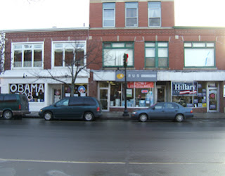
The Obama and Clinton headquarters in Rochester, New Hampshire are just two doors away from each other. Not certain these really represent how things are going for the two campaigns but there's a pretty clear contrast.
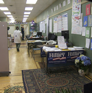
Clinton's campaign headquarters: organized but not the liveliest joint.

Obama's headquarters are bustling and a little chaotic...

...with an incredible snack table.
Obama '08 Gets Campaign Logo Design Right
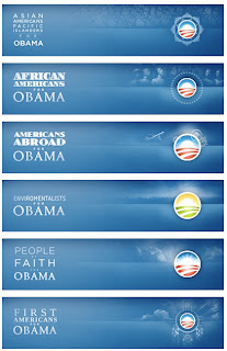
Speak Up's terrific analysis of the Barack Obama campaign's skillful use of their campaign '08 logo.
"For each segment of people, the logo changes accordingly, tip-toeing a fine line between cliché and clever, and never crossing to the former's dark side. The iterations are quickly identifiable and feel genuinely concerned with connecting to the people they are talking to, without pandering. The executions are rather flawless and work perfectly on screen with the detailed gradients and subtle background illustrations. Even the typography is lovingly handled, with each segment changing ever so slightly and unified by the use of Gotham in most of the applications, and using other typefaces as fitting — even the "kids" typography looks finessed, despite the looming pitfalls of faux child-drawn typography. This kind of playful flexibility is typically reserved for the likes of MTV, VH1 or Nickelodeon and the breadth of this kind of brand architecture for global corporations with endless divisions."
"For each segment of people, the logo changes accordingly, tip-toeing a fine line between cliché and clever, and never crossing to the former's dark side. The iterations are quickly identifiable and feel genuinely concerned with connecting to the people they are talking to, without pandering. The executions are rather flawless and work perfectly on screen with the detailed gradients and subtle background illustrations. Even the typography is lovingly handled, with each segment changing ever so slightly and unified by the use of Gotham in most of the applications, and using other typefaces as fitting — even the "kids" typography looks finessed, despite the looming pitfalls of faux child-drawn typography. This kind of playful flexibility is typically reserved for the likes of MTV, VH1 or Nickelodeon and the breadth of this kind of brand architecture for global corporations with endless divisions."

Sunday, January 6, 2008
Luxury With A Conscience
Barry Sternlicht's newest creation: 1 Hotel and Residence
1 redefines a new archetype of luxury in hotel and residential living: a one of a kind, sophisticated, modern environment that dares to be the best of everything without sacrificing the greater environment. Committed to protecting and preserving our resources, the creators of 1 believe that one can find sublime experiences in hospitality and in personal lifestyle experiences without diminishing the natural world.
Barricade and Initial Advertising from 1's opening location, Seattle.


Labels:
architecture,
design,
environment,
retail,
scene
Wednesday, January 2, 2008
Bblessing Home Absinthe Set

One of my favorite men's stores, Bblessing, just launched their brand-spanking new home line. These graphic absinthe spoons—the first pieces in the line—were designed by Surface to Air's Daniel Jackson in keeping with the store's interior, which was "very much inspired by my own abstraction of a fin de siècle Absinthe bar."
For those unfamiliar with the absinthiana, the ritual of drinking the famed, mind-bending spirit, the spoons are used to dissolve a sugar cube in the drink to lessen its bitterness.
If you're in the market
Tuesday, January 1, 2008
PANTONE's 2008 Color of the Year: 18-3943 BLUE IRIS

"Pantone, Inc selected PANTONE® 18-3943 BLUE IRIS, a beautifully balanced blue-purple, as the color of the year for 2008. Combining the stable and calming aspects of blue with the mystical and spiritual qualities of purple, Blue Iris satisfies the need for reassurance in a complex world, while adding a hint of mystery and excitement. " "From a color forecasting perspective, we have chosen PANTONE 18-3943 Blue Iris as the color of the year, as it best represents color direction in 2008 for fashion, cosmetics and home products," explains Leatrice Eiseman, executive director of the Pantone Color Institute®. "As a reflection of the times, Blue Iris brings together the dependable aspect of blue, underscored by a strong, soul-searching purple cast. Emotionally, it is anchoring and meditative with a touch of magic. Look for it artfully combined with deeper plums, red-browns, yellow-greens, grapes and grays."
Subscribe to:
Comments (Atom)


