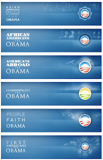
"For each segment of people, the logo changes accordingly, tip-toeing a fine line between cliché and clever, and never crossing to the former's dark side. The iterations are quickly identifiable and feel genuinely concerned with connecting to the people they are talking to, without pandering. The executions are rather flawless and work perfectly on screen with the detailed gradients and subtle background illustrations. Even the typography is lovingly handled, with each segment changing ever so slightly and unified by the use of Gotham in most of the applications, and using other typefaces as fitting — even the "kids" typography looks finessed, despite the looming pitfalls of faux child-drawn typography. This kind of playful flexibility is typically reserved for the likes of MTV, VH1 or Nickelodeon and the breadth of this kind of brand architecture for global corporations with endless divisions."
